Saw someone on Facebook suggest a graphic designer take WV and represent the Appalachian mountains
Saw someone on Facebook suggest a graphic designer take WV and represent the Appalachian mountains. I don’t do a ton of graphic design like that anymore, so I thought it would be a fun logo exploration after work today.
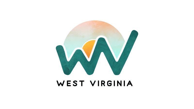
I started with WV from a font…the same font as the bottom. I then manipulated the letters to get the shape you see that represent the mountains.
I wanted something that kept the WV obvious, but actually looked like mountains. I also wanted the form to grow from left to write to signify movement and progress (upward and onward!).
If I utilized this design, I would match the stroke of the sun with the space between the wv and the sky. I was trying to convey some depth with the lines being different weights, but with just two lines, it doesn’t quite work.
I would also experiment with moving the sun around. I originally was making a nod to a sunrise/breakfast fried egg/new day, but I didn’t carry that through.
I experimented with some colors and probably would more if given the time. All in all, it was a fun little experiment to keep my creative juices sharp.
I feel like I’ve seen a very similar WV mark before, so I’m wondering if it’s stuck somewhere in the recesses of my mind. Anyone recognize it?
I’m currently brainstorming what kind of fun phrases I would include in place of West Virginia if this was a fun sticker, t-shirt, or swag item. What do you think?